top of page
.png)
UI/UX
DESIGNS
CASTLE WALL PC/MOBILE GAME
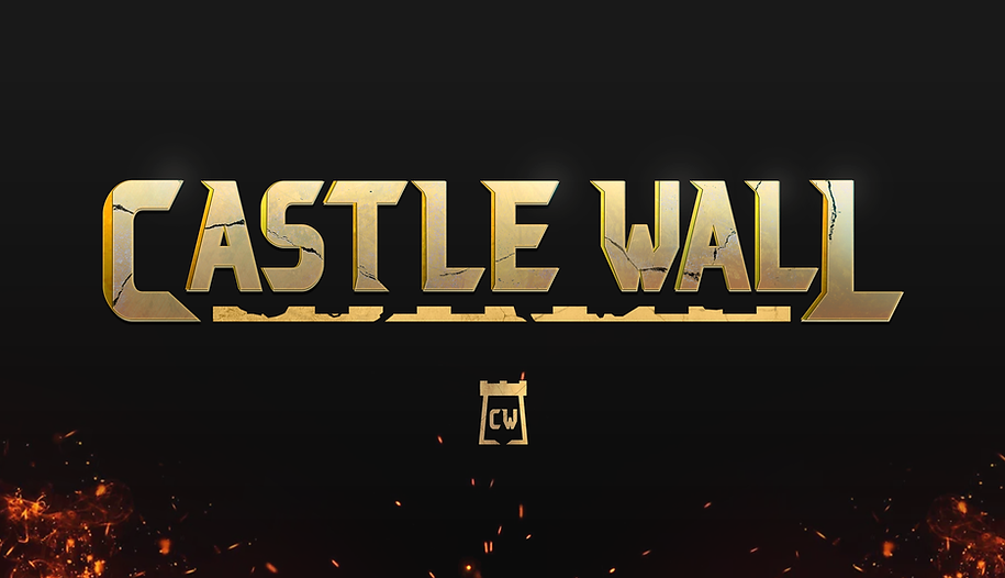
MAIN LOGO
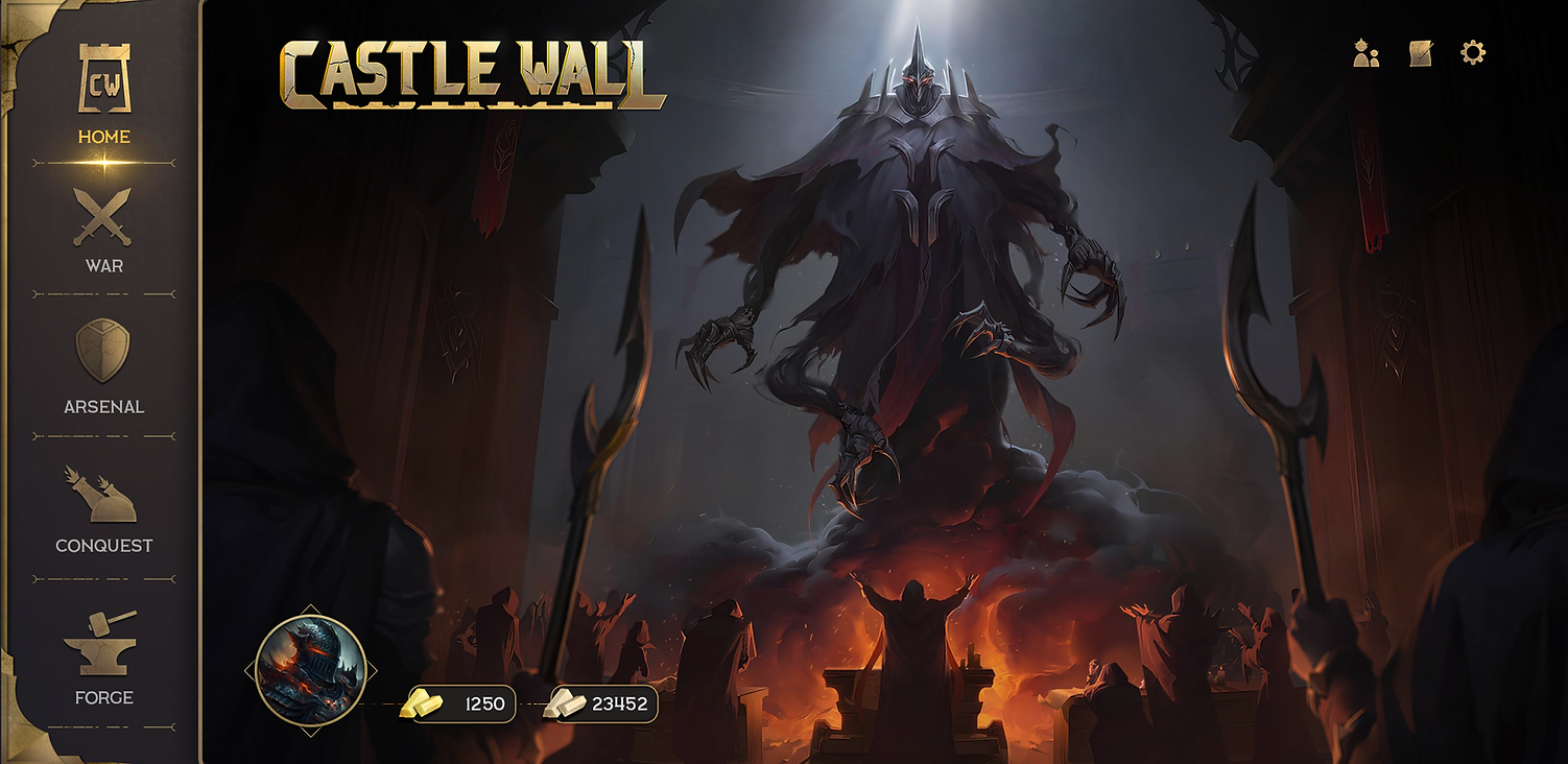
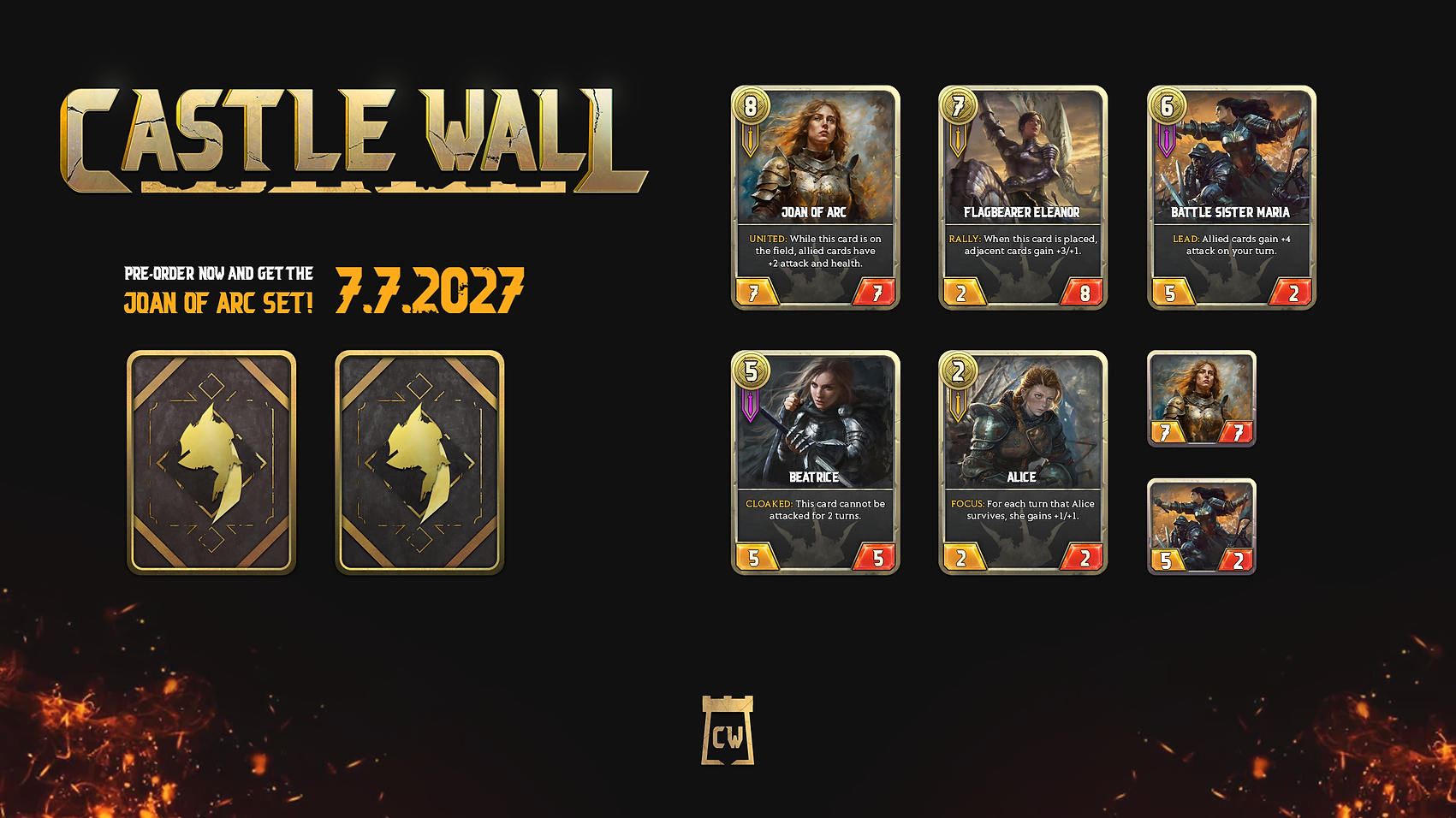
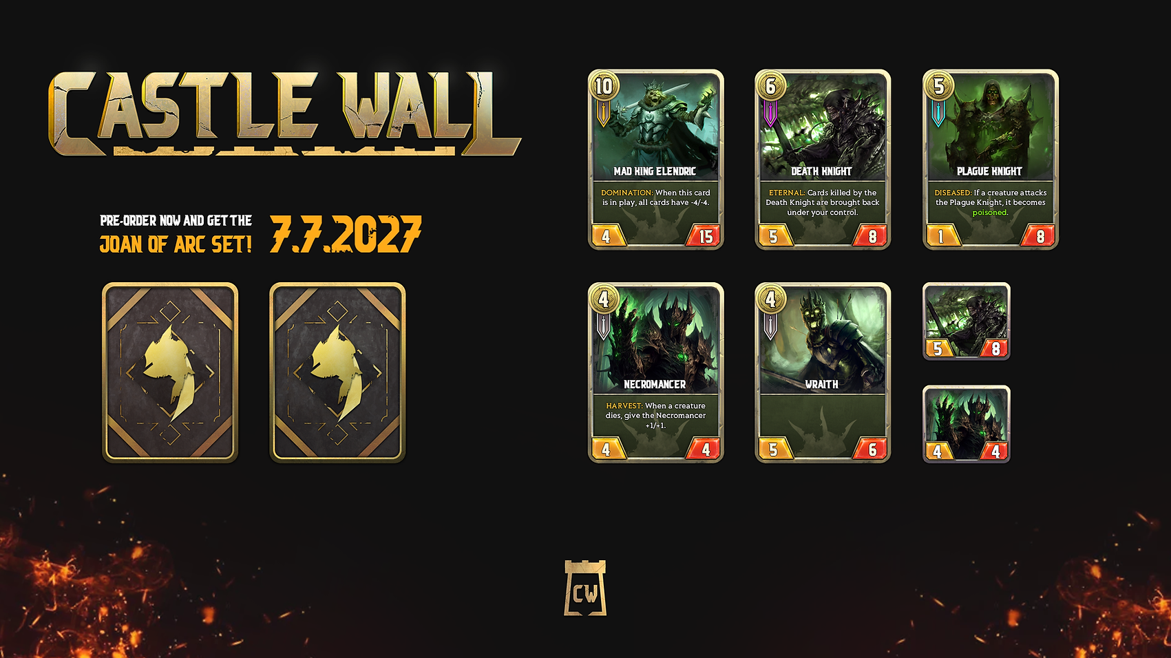
NOTE: Illustrative assets such as the digital paintings of the knights were not made by me. Everything else such as icons, logos, buttons, game board, etc, were.

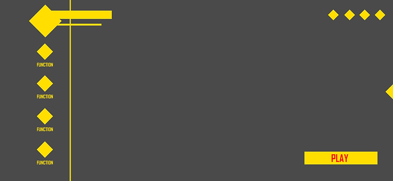
MAIN MENU SCREEN
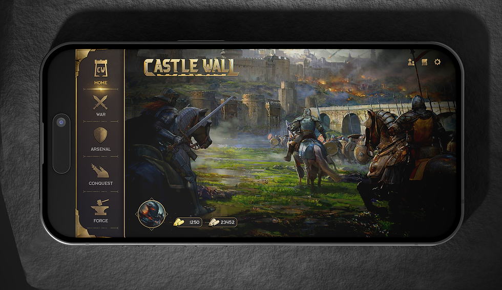
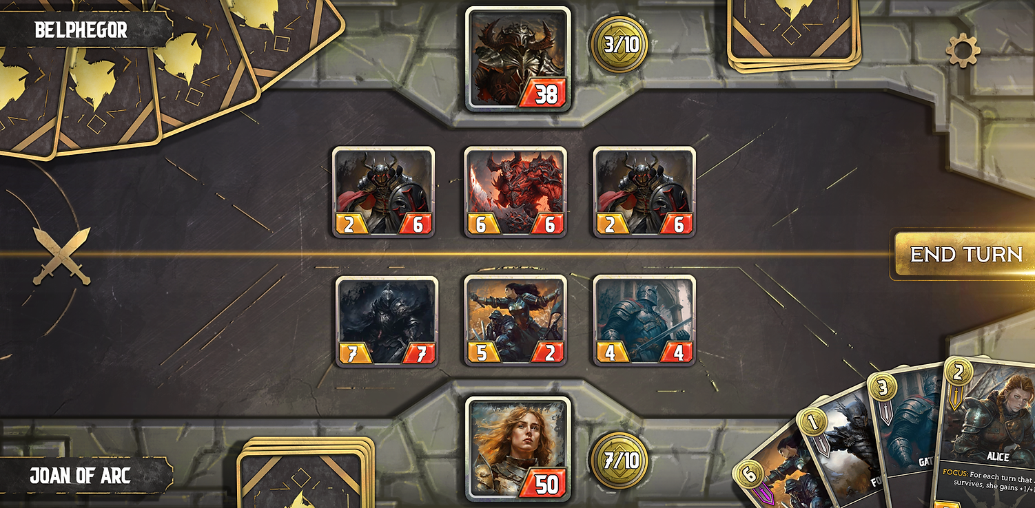
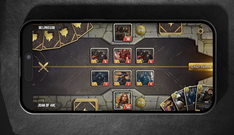
It is important for assets to pop out when playing on a mobile device. Ensuring that the size and contrast of the visual elements guide the player's eyes is a vital aspect of user experience.


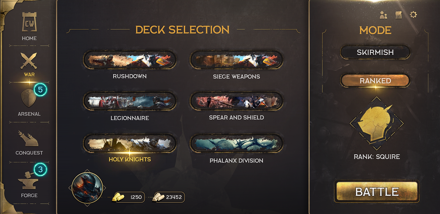
PLAY SELECTION SCREEN
Typically, a person grabs the phone with both hands and plays the game horizontally. The purpose of the buttons being on the sides is so that everything is within the thumb's reach. In the West, people also read from left to right. The design shown here naturally supports the hierarchy needed before accessing a match (Mode > selection > play).

GAME TABLE


ASSETS


SKETCH PHASE
Research such as game design, what is needed in the UI, color coding, etc, are planned as an ingredient list. Sketches are created as quick visualization methods for testing/fitting on screens as many potential issues can be caught and rectified in these earlier stages. The cost to fix mistakes gets multiplied or sometimes becomes irreversible in the latent stages of development and we want to prevent that.


bottom of page